I've gotten a little off the pace with recent themes from SPC. The last theme that I posted every week was 'Pattern' back in August, 2007. Since then, I've posted at least one self portrait for every challenge, but haven't posted more than one in a month since I did three for 'Blue' in February.
It seems that I'm not the only one who's been slacking. It appears to me that weekly posting numbers at SPC have been down in recent months across the board (with a steadfast few being the exception).
So there I was thinking that with posting being down on the last couple of themes that Kathreen (the lady who created and still runs SPC) might pull out a no-brainer theme -- something easier for the masses. Perhaps something a little less -- challenging.
You know --
'straight-on mirror self portraits'
or
'arms-length self portraits'
or
'top-down shots of your feet.'
But no — Kath goes and kicks it up a notch.
Nude
How’s that for a challenge?
Here's another thing, though. For whatever reason, almost all of the regular contributors over at SPC are women. Besides myself, there have been maybe 2 or 3 other guys who have taken up the Self Portrait Challenge on a regular basis.
As I was considering whether or not to sit this month out altogether, I was reminded of the following scene from my favorite television show, Seinfeld:
Jerry, [seeing Elaine enter Monk's]: "Oh, great. Elaine. What is wrong with
my body?"
Elaine: "Chicken wing shoulder blades."
Jerry: "That's it?"
Elaine: "No, but that's one problem. Why?"
Jerry: "Well, I was walking around naked in front of Melissa the other day--"
Elaine: "Whoa! Walking around naked? Ahh... that is not a good look for a
man."
George: "Why not? It's a good look for a woman."
Elaine: "Well, the female body is a... work of art. The male body is
utilitarian, it's for gettin' around, like a jeep."
Jerry: "So you don't think it's attractive?"
Elaine: "It's hideous. The hair, the... the lumpiness. It's simian."
George: "Well, some women like it."
Elaine: "Hmm. Sickies."
Seinfeld -- The Apology
...and there you have it.
But despite all that, I decided to participate with at least one submission this month.
[full-out geek speak ahead]
Fortunately for me (and everybody else who's reading this), I got a new camera lens for the anniversary of the day on which I was born which we celebrated in late May. The new lens has a large aperture. In photography, this means a number of things.
The aperture of a lens is the size of the opening at the back end of the lens. It determines the amount of focused light that the lens allows through to the digital sensor or film. This means that large apertures allow for shooting in relatively low light without flash at shutter speeds that don't require a tripod. A major advantage in many settings.
The aperture of a lens also plays a part in controlling depth of field. Basically, depth of field is the amount of depth in the photo that has an acceptable level of focus. Very small apertures (f/22, f/36) will have a huge depth of field, that is, most of the entire frame of the photo will appear in focus, front to back. This is great for landscapes where you want as much detail to be seen as possible. Very large apertures (f/2.8, f/1.4) will have a very shallow depth of field. There will be a single plane with sharp focus and anything closer or further away from the lens will quickly blur to fuzzy shapes. This is often great for portraits or other single subject compositions where you want that single object, person, etc. to 'pop,' and the entire background consists of blurry colors and soft shapes. With these large apertures, you can easily get the tip of a person's nose in sharp focus, but the eyes are blurry (oops!), but when they are used correctly and carefully, you can also create very dramatic photographs with them.
There are other factors in play also (focal length, distance to subject, etc.). Hey, there's a reason why the concept is referred to as the Circle of Confusion.
[/geek speak]
I said all that for a couple of reasons.
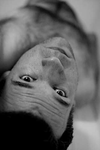
1.) I believe in the photo below, you'll notice the effect of a shallow depth of field made possible by the large aperture. You'll see that the sharpest focus is on my eyes and everything else quickly blurs (please forgive a bit of camera shake).
and
2.) It ought to put the photo far enough down the page that it won't be seen without scrolling down a bit which should give anybody who just doesn't want to see the photo plenty of time to bail out.
:-)

See what others are doing with the theme here.


No comments:
Post a Comment